Wednesday, May 28, 2008

My Winnipeg: Great Movie Poster

I absolutely loved Guy Maddin's film The Saddest Music in the World. Now he's coming out with a new movie called My Winnipeg which is described as "a hilariously wacky and profoundly touching goodbye letter to his childhood hometown. " 


I LOVE this poster! I find the muted colors, scratched film and worn corners very appealing. It's like the most screwed up photo in your family album. The unique elements jump out at you. I like the jumper's tropical looking shirt and the look of utter indifference on the older lady's face. I also find it hilarious that Winnipeg is being compared to suicide.

Check out the trailer:

Friday, May 23, 2008

Book 2, Background Info: Another Roadside Attraction by Tom Robbins

The reason I originally picked up Another Roadside Attraction was the fact that it had to do with… wait for it… roadside attractions! In the novel, a circus/naturalist/mystical/hippie couple open up a hotdog stand in Washington state called “Captain Kendrick's Memorial Hot Dog Wildlife Preserve”. The draw to this site is the 30-foot tall hot dog sign on the roof, an endangered garter snake habitat, flea circus, and a certain corpse of a Christian persuasion.

I think I’ve a certain affinity for these slowly disappearing roadside oddities. I could be due to the fact that I’ve grown up with one in my backyard ever since I was little.


The Big Blue Bug is Rhode Island’s strangest and most visible landmark. Directly looking out over I-95, its New England Pest Control’s highly inventive piece of advertising. I don’t think there’s a single person in Rhode Island who doesn’t know the name New England Pest Control because of that giant blue landmark. If you’re ever driving through Providence, RI you can’t miss it.

Some other sites you might also be interested in:

The Thing?, Dragoon Arizona
What is The Thing? Drive out to the middle of nowhere and find out!

Along I-75, it’s the county’s tribute to the peanut.

Clark’s Trading Post, N. Woodstock, NH
My Favorite place in the entire world! Check out the performing bear shows and get chased by the crazed hillbilly “Wolfman” on a scenic train ride… I’m not making this up.

To learn more about roadside attractions near you, be sure to check out Roadside America, the definitive website for those weird little places around the country.

Monday, May 19, 2008

Book 1, Revamped Art: Pedro Páramo by Juan Rulfo

Thanks to the great comments from my friends in the last Pedro Paramo post, I am instituting a new element to PRETTY DEAD TREES: the Revamp! I'll take your suggestions and give it one last go.

It was suggested that the big black title block in the upper lefthand corner took away from the image. After studying it, I had to agree. So I ran with the old photo motif and decided to incorporate an old looking (possibly blood spattered ) label. And here's what came out of that:


I think it looks much better. But what do you think?

Friday, May 16, 2008

House of Mystery #1: Great Comic Cover


DC Comics, Vertigo line (who might I say always has some kick ass covers from the likes of James Jean, Brian Wood, Dave Johnson, etc.) has just released a new comic called House of Mystery with covers by Sam Weber.

From Vertigo: "House of Mystery focuses on five characters trapped in a supernatural bar, trying to solve the mystery of how and why they're imprisoned there. Each one has a terrible past they'd like to forget, and with no books, newspapers or TV allowed in the House, they face an eternity of boredom. But stories become the new currency, and fortunately, the House attracts only the finest storytellers." 

The cool concept with this comic is that the regular writers (Matthew Sturges and Bill Willingham) and artists (Luca Rossi and Sean Murphy) work on the "5 people stuck in the house" story while a guest artist comes in every issue and create the guests' tales.

What makes this cover interesting is the unified split image. The ghostly visage of a woman's head pouring out of a dark house definitely hits the mystery nail on the head. But the blood drops surrounded by flies making her eyes creates a sinister air (and perfectly ties in the extremely f***ed up story inside). I also love the vintage font used for the title. I don't know why the T in the middle of Mystery is more ornate than the rest... but I love how it looks.

Check out the covers for #2 & #3:


With great covers and an equally great story concept, I'm definitely making this a monthly purchase.

Wednesday, May 14, 2008

Book 2, Original Art: Another Roadside Attraction by Tom Robbins


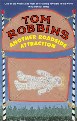
ANOTHER ROADSIDE ATTRACTION by Tom Robbins

Published by Bantam Books, Copyright 1991; Original Cover Design by Les LePere

"What if the Second Coming didn't quite come off as advertised? What if 'the Corpse' on display in that funky roadside zoo is really who they say it is--what does that portent for the future of western civilization? And what if a young clairvoyant named Amanda reestablishes the flea circus as popular entertainment and fertility worship as the principal religious form of our high-tech age? Another Roadside Attraction answers those questions and a lot more. It tells us, for example, what the sixties were truly all about, not by reporting on the psychedelic decade but by recreating it, from the inside out. In the process, this stunningly original seriocomic thriller eating a literary hotdog and eroding the borders of the mind."

Support an Independent Book Store! CLICK HERE to Purchase this Book!

Friday, May 9, 2008

Book 1, Reimagined Art: Pedro Páramo by Juan Rulfo

As a work of magical realism, Pedro Paramo places the "main character" Juan Preciado in a literal ghost town. He is the only living being within the village of Comala and yet he is able to interact with deceased townsfolk. We the readers learn about the seedy history of this small village and the evil deeds of Juan's absentee father, Pedro Paramo, through the stories of the dead.


Thinking of imagery for this novella, my mind had gone to Mexico's Day of the Dead celebration and their skeleton motifs (in decoration and dress). The thing I like about this holiday, in relation to the book, is the belief that it is the one day where the dead can visit the living more easily. 

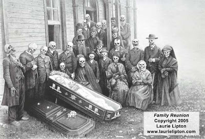
After a little poking around the web, I came across this wonderful piece from artist Laurie Lipton called "Family Reunion" :


Used by Permission in thanks to Laurie Lipton

Great, huh? What's more perfect for this novella than the dead at a funeral?

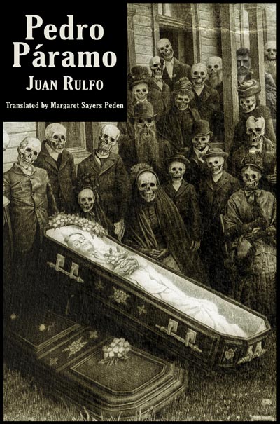
I aged the image a little bit, giving it a sepia tone with pops and scratches, mimicking an old photograph.


What made this piece absolutely perfect for my needs was the "hidden" character. If you look real closely at the top of the group, you can see one living person among the dead! I lightened this man ever so slightly to make him subtly stick out from the group.


Putting together all of these elements and borrowing a layout choice from the original cover, I came out with this final version:


My first reimagined cover: Pedro Paramo by Juan Rulfo, translated by Margaret Sayers Peden. Again, I would like to graciously thank Laurie Lipton for the use of her artwork.

The floor is now open for comments, questions, suggestions, and critiques.

Wednesday, May 7, 2008

Book 1, Original Art: Pedro Páramo by Juan Rulfo


PEDRO PARAMO by Juan Rulfo
Translated by Margaret Sayers Peden

Published by Grove Press, Copyright 1994
Original Cover Design by ???


"Beseeched by his dying mother to locate his father, Pedro Paramo, whom they fled from years ago, Juan Preciado sets out for Comala. Comala is a town alive with whispers and shadows - a place seemingly populated only by memory and hallucinations. Built on the tyranny of the Paramo family, its barren and broken-down streets echo the voices of tormented spirits sharing the secrets of the past. First published to both critical and popular acclaim in 1955, Pedro Paramo represented a distinct break with earlier, largely "realist" novels from Latin America. Rulfo's entrancing mixture of vivid sensory images, violent passions, and inexplicable sorcery - a style that has come to be known as "magical realism" - has exerted a profound influence on subsequent Latin American writers."

Support an Independent Book Store!
CLICK HERE to Purchase this Book!

Tuesday, May 6, 2008

You CAN Judge a Book By Its Cover.

As a self-taught designer, my schooling is based on the things I see around me: magazines, advertisements, posters, t-shirts, bumper stickers, billboards, television, film, postcards, album covers, theater, and… book covers.

An avid reader, bookshelves have always surrounded me. Books have always been an important part of my life and I wholeheartedly agree (to summarize years and years of literary propaganda) Reading is Good.

I’m currently enrolled in Rhode Island School of Design’s Print Design Process + Production program where I will begin to learn how to take my own design ideas and properly incorporate them into professional looking products. Right now they look like printed-off-the-computer-that-I-got-for-free-with-my-computer products. In other words, a little crappy.

My dream is that I will one day design book covers professionally. Pretty Dead Trees is my foray into this field. By regularly creating new designs and showcasing them for creative criticism, I hope to improve upon my skills.


This is how the project will work:

1) I pick a book to read based off a ridiculous method of page counting and coin flipping.
2) I post a link or picture of that particular edition’s cover and summary of said book.
3) When I finish the book, I create my own cover design and post it here for your comments, questions, praises and ridicule.
4) Interspersed among these designs, I’ll be dropping some interesting links and commentary about various design (and cultural) things you might find interesting.

So there you are, Pretty Dead Trees in a rather large nutshell. Hopefully, this blog will be an interesting record of my progression as a designer and it might even be interesting… hey, anything can happen!

Stay tuned!