Friday, June 5, 2009

The Garden: Great Movie Poster


I happened to see this poster at my local movie house and it blew me away.

THE GARDEN is about the largest inner-city, community garden in the US, right in South Central LA, and how the political forces of the city government have tried to take this haven away from it's people.

Although the online version doesn't do it justice, it does reflect how you might see it as a passerby. This off-center, off-kilter dark block is actually an aerial picture of the garden. The designer washed out and outlined the surrounding neighborhood in white and very light grey. It is almost as difficult to see this background in person as it is online.

I think what I like about this poster it the "Ah-Ha" moment you get when you finally realize what it is. You need to get close up and engage the design to totally get what's going on. It's a simple design with a lot going on. Heck, it got me to stop and look...


Movie Description:
THE GARDEN is an engaging and powerful look at the famous political and social battle over the largest community garden in the US (located in South Central Los Angeles). A follow-up to Kennedy’s award-winning documentary OT: OUR TOWN, the film shows how the politics of power and greed (backroom deals, land developing, green politics, money) tragically intersect with working class families who rely on this communal garden for their livelihood. Equal parts THE WIRE and HARLAN COUNTY USA, THE GARDEN exposes the fault lines in American society and raises crucial and challenging questions about liberty, equality, and justice for the poorest and most vulnerable among us. Kenneth Turan of the LA Times said: “It’s tempting to call “The Garden” a story of innocence and experience, of evil corrupting paradise, but that would be doing a disservice to the fascinating complexities of a classic Los Angeles conflict and an excellent documentary that does them full justice.”

Monday, May 11, 2009

CHECK IT OUT: Wellmedicated.com

My friend Thom brought to my attention WellMedicated.com, a design site with some great lists.

Click on the pictures below to check some out:

50 Amazing Gig Posters Sure to Inspire


50 Incredible Film Posters from Poland


25 Imaginative Illustrations Inspired by Film

There are many, many more posts of interest over there so be sure to check them out!

Thursday, May 7, 2009

Book 4, Background Info: Travels with Charley by John Steinbeck


In 1960 and at the age of 58, John Steinbeck decided to make one last trip around the United States. With his French poodle Charley and a pickup truck converted into a camper, he traveled across this country, roughly around the boarder of the continental US.


Trying to find and talk to the "New American" he purposely tried to avoid major highways and cities, opting to travel the old, quiet back-roads that once linked this country together.

What's interesting about this work is that it is not so much a "road book" but rather a report of the death of early America. Steinbeck needed to see for himself whether or not the hard working, simple country he knew and had brought to light in novels like Of Mice and Men and The Grapes of Wrath still existed. While he still came across pockets of this simple life, he was begrudgingly taught that the world that he once new was dying with his generation.

With the proliferation of nuclear arms, the Vietnam War, violence stemming from the civil rights movement, etc., history has taught us that this age of American innocence truly faded away just a few short years after this book was published.

Click pictures above to check out more information on Travels with Charley.

Monday, May 4, 2009

Slightly New Format on Design Covers

Upon further reflection, I've realized the folly of my ways. How dare I just include the front cover of a book when there's AT LEAST two other printable areas?!

From now on I'm going to change it up a little bit. Upon selecting a book I will state whether that book was hardcover or paperback. If the book was hardcover, I will design an entire dust jacket (front, spine, back and two inner flaps). If the book was paperback, I will design a standard cover (front, spine and back).

Be sure to check back this week for some background info on Travels with Charley as well as a new cover design that has caught my eye.

Tuesday, April 28, 2009

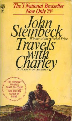
Book 4, Original Art: Travels with Charley by John Steinbeck


TRAVELS WITH CHARLIE by John Steinbeck

Published by Bantam Books, Copyright 1963; Original Cover Design by ???

"In September 1960, John Steinbeck and his poodle, Charley, embarked on a journey across America. A picaresque tale, this chronicle of their trip meanders along scenic backroads and speeds along anonymous superhighways, moving from small towns to growing cities to glorious wilderness oases. Travels with Charley is animated by Steinbeck's attention to the specific details of the natural world and his sense of how the lives of people are intimately connected to the rhythms of nature - to weather, geography, the cycles of the seasons. His keen ear for the transactions among people is evident, too, as he records the interests and obsessions that preoccupy the Americans he encounters along the way."

Support an Independent Book Store! CLICK HERE to Purchase this Book!

Tuesday, March 3, 2009

Book 3, Reimagined Art: VOX by Nicholson Baker

HOLY CRAP! It's been 6 months and Matt finally has something to put up!

Anywho...

So, to refresh your memory this book is one long phone conversation leading to phone sex. For this cover I wanted the foundation to be a fairly sexy head shot of a woman talking on the phone. However, I wasn't able to drum up a willing female volunteer for a photograph... 

Okay that sounded a little dirty. But I digress.

I ended going in the ironic direction. I found a perfect vintage, black and white photo of a 50's housewife on the web. 


I used the magic of Matt-i-color (the cheap Rhode Island version of Technicolor) and brightened up the picture a bit.


I then imported the whole sha-bang into Illustrator and, using Adobe trickery and a darker picture, brought the title magically out of the photo. Voila! The finished cover:


The floor is now open for comments, questions, suggestions, and critiques.

And keep an eye out on the site soon. I'll be posting various projects I've done in class... the 21st century version of a spelling test on the fridge!