
As a work of magical realism, Pedro Paramo places the "main character" Juan Preciado in a literal ghost town. He is the only living being within the village of Comala and yet he is able to interact with deceased townsfolk. We the readers learn about the seedy history of this small village and the evil deeds of Juan's absentee father, Pedro Paramo, through the stories of the dead.
Thinking of imagery for this novella, my mind had gone to Mexico's Day of the Dead celebration and their skeleton motifs (in decoration and dress). The thing I like about this holiday, in relation to the book, is the belief that it is the one day where the dead can visit the living more easily.
After a little poking around the web, I came across this wonderful piece from artist Laurie Lipton called "Family Reunion" :
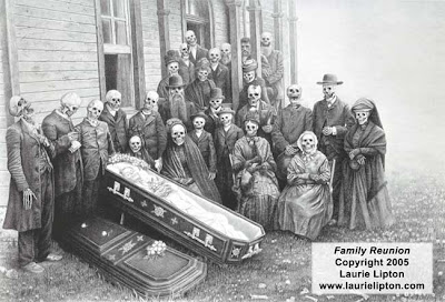
Used by Permission in thanks to Laurie Lipton
Great, huh? What's more perfect for this novella than the dead at a funeral?
I aged the image a little bit, giving it a sepia tone with pops and scratches, mimicking an old photograph.

What made this piece absolutely perfect for my needs was the "hidden" character. If you look real closely at the top of the group, you can see one living person among the dead! I lightened this man ever so slightly to make him subtly stick out from the group.

Putting together all of these elements and borrowing a layout choice from the original cover, I came out with this final version:
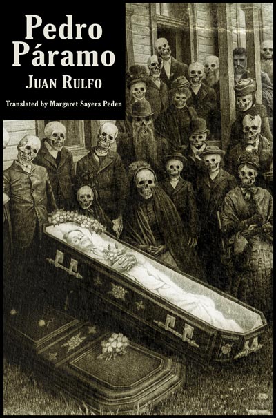
My first reimagined cover: Pedro Paramo by Juan Rulfo, translated by Margaret Sayers Peden. Again, I would like to graciously thank Laurie Lipton for the use of her artwork.
The floor is now open for comments, questions, suggestions, and critiques.


6 comments:
that image is a great find! somehow the black box seems a little too drastic. perhaps I would suggest a semi-opaque background for that box of text instead of stark black? Maybe play with different fonts as well?
What a GREAT blog! Glad you're doing this!
Your reimagined book cover gives me such insight into the novel. The sepia tone is a nice touch. You're dead-on (excuse the pun) with guiding us to imagine that the image is a photograph. Beautiful work by Laurie Lipton. I am strangely moved by the two skeleton men who seemed to have been bashed in the head (background) and the guy who looks like he was hung (foreground).
The image makes me chuckle--it's somehow humorous to me. I like the idea that skeletons, if they still have the jaw intact, are either smiling or laughing.
I love the fact that the only "living" being in the picture almost didn't make it onto the porch, blocked by columns, and dead people, he's nearly out of the frame; he's overshadowed by his skeleton family who seem so happy that the decaying woman in the coffin will soon be the new set of bones in town. It's a weird birth image. . .
I do agree with Jason about the black box-- it's the logical place to put the text, but it's like an anvil hanging over this delicate drawing, that endears itself to you the more you look at it.
I need to check out more of Laurie Lipton's art. What a find.
Can't wait to see what's next!!
Matt, I love your choice of imagery. And it makes me so happy to hear that you're working towards your dream.
I agree that the black box seems a bit to heavy. Maybe the box could be a little washed out like the image?
Good call all around! The more I stare at it, I realize now that the block takes away from everything way too much. I'll take all of your suggestions into consideration when I revamp it at a later date!
Hola, buen día, a ver ya no entendí, la tapa del libro entonces pertenece a una edición o sólo es una creación personal ????
Pertenece a una edicion traducida en ingles
Post a Comment