Wednesday, July 21, 2010

Goodbye Blogger

Chances are that if you're reading the comments will be Chinese spam messages. So...

I'm moving Pretty Dead Trees to Tumblr!

Please update your bookmarks to: http://prettydeadtrees.tumblr.com/

Friday, June 5, 2009

The Garden: Great Movie Poster


I happened to see this poster at my local movie house and it blew me away.

THE GARDEN is about the largest inner-city, community garden in the US, right in South Central LA, and how the political forces of the city government have tried to take this haven away from it's people.

Although the online version doesn't do it justice, it does reflect how you might see it as a passerby. This off-center, off-kilter dark block is actually an aerial picture of the garden. The designer washed out and outlined the surrounding neighborhood in white and very light grey. It is almost as difficult to see this background in person as it is online.

I think what I like about this poster it the "Ah-Ha" moment you get when you finally realize what it is. You need to get close up and engage the design to totally get what's going on. It's a simple design with a lot going on. Heck, it got me to stop and look...


Movie Description:
THE GARDEN is an engaging and powerful look at the famous political and social battle over the largest community garden in the US (located in South Central Los Angeles). A follow-up to Kennedy’s award-winning documentary OT: OUR TOWN, the film shows how the politics of power and greed (backroom deals, land developing, green politics, money) tragically intersect with working class families who rely on this communal garden for their livelihood. Equal parts THE WIRE and HARLAN COUNTY USA, THE GARDEN exposes the fault lines in American society and raises crucial and challenging questions about liberty, equality, and justice for the poorest and most vulnerable among us. Kenneth Turan of the LA Times said: “It’s tempting to call “The Garden” a story of innocence and experience, of evil corrupting paradise, but that would be doing a disservice to the fascinating complexities of a classic Los Angeles conflict and an excellent documentary that does them full justice.”

Monday, May 11, 2009

CHECK IT OUT: Wellmedicated.com

My friend Thom brought to my attention WellMedicated.com, a design site with some great lists.

Click on the pictures below to check some out:

50 Amazing Gig Posters Sure to Inspire


50 Incredible Film Posters from Poland


25 Imaginative Illustrations Inspired by Film

There are many, many more posts of interest over there so be sure to check them out!

Thursday, May 7, 2009

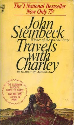
Book 4, Background Info: Travels with Charley by John Steinbeck


In 1960 and at the age of 58, John Steinbeck decided to make one last trip around the United States. With his French poodle Charley and a pickup truck converted into a camper, he traveled across this country, roughly around the boarder of the continental US.


Trying to find and talk to the "New American" he purposely tried to avoid major highways and cities, opting to travel the old, quiet back-roads that once linked this country together.

What's interesting about this work is that it is not so much a "road book" but rather a report of the death of early America. Steinbeck needed to see for himself whether or not the hard working, simple country he knew and had brought to light in novels like Of Mice and Men and The Grapes of Wrath still existed. While he still came across pockets of this simple life, he was begrudgingly taught that the world that he once new was dying with his generation.

With the proliferation of nuclear arms, the Vietnam War, violence stemming from the civil rights movement, etc., history has taught us that this age of American innocence truly faded away just a few short years after this book was published.

Click pictures above to check out more information on Travels with Charley.

Monday, May 4, 2009

Slightly New Format on Design Covers

Upon further reflection, I've realized the folly of my ways. How dare I just include the front cover of a book when there's AT LEAST two other printable areas?!

From now on I'm going to change it up a little bit. Upon selecting a book I will state whether that book was hardcover or paperback. If the book was hardcover, I will design an entire dust jacket (front, spine, back and two inner flaps). If the book was paperback, I will design a standard cover (front, spine and back).

Be sure to check back this week for some background info on Travels with Charley as well as a new cover design that has caught my eye.

Tuesday, April 28, 2009

Book 4, Original Art: Travels with Charley by John Steinbeck


TRAVELS WITH CHARLIE by John Steinbeck

Published by Bantam Books, Copyright 1963; Original Cover Design by ???

"In September 1960, John Steinbeck and his poodle, Charley, embarked on a journey across America. A picaresque tale, this chronicle of their trip meanders along scenic backroads and speeds along anonymous superhighways, moving from small towns to growing cities to glorious wilderness oases. Travels with Charley is animated by Steinbeck's attention to the specific details of the natural world and his sense of how the lives of people are intimately connected to the rhythms of nature - to weather, geography, the cycles of the seasons. His keen ear for the transactions among people is evident, too, as he records the interests and obsessions that preoccupy the Americans he encounters along the way."

Support an Independent Book Store! CLICK HERE to Purchase this Book!

Tuesday, March 3, 2009

Book 3, Reimagined Art: VOX by Nicholson Baker

HOLY CRAP! It's been 6 months and Matt finally has something to put up!

Anywho...

So, to refresh your memory this book is one long phone conversation leading to phone sex. For this cover I wanted the foundation to be a fairly sexy head shot of a woman talking on the phone. However, I wasn't able to drum up a willing female volunteer for a photograph... 

Okay that sounded a little dirty. But I digress.

I ended going in the ironic direction. I found a perfect vintage, black and white photo of a 50's housewife on the web. 


I used the magic of Matt-i-color (the cheap Rhode Island version of Technicolor) and brightened up the picture a bit.


I then imported the whole sha-bang into Illustrator and, using Adobe trickery and a darker picture, brought the title magically out of the photo. Voila! The finished cover:


The floor is now open for comments, questions, suggestions, and critiques.

And keep an eye out on the site soon. I'll be posting various projects I've done in class... the 21st century version of a spelling test on the fridge!

Tuesday, September 30, 2008

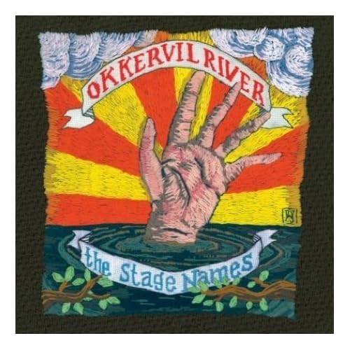
Amazing Album Covers: Okkervil River & William Schaff

I'd been hearing a lot about this band called Okkervil River. So I picked up their new CD, The Stand Ins, and I have to say I like them quite a bit. They have this very melodic and eclectic sound reminiscent of a lot of bands I've been listening to lately. Go to their site to check out their tunes.

One thing I didn't catch right away, though, was a very special detail about their album covers.


They're not done on a computer. They're not drawn or painted. That's right all my crafty friends out there... THEY'RE EMBROIDERED! How fucking cool it that?!

To top it all off (and to demonstrate how small Rhode Island is), the artist, William Schaff, is a local Providence musician who plays with the What Cheer? Brigade

What a small world...

Friday, September 5, 2008

International Covers and Process: The Gone-Away World

I'm currently reading THE GONE-AWAY WORLD by Nick Harkaway which, might I say, is one hell of a page turner. Here's the description:

There couldn’t be a fire along the Jorgmund Pipe. It was the last thing the world needed. But there it was, burning bright on national television. The Pipe was what kept the Livable Zone safe from the bandits, monsters, and nightmares the Go-Away War had left in its wake. The fire was a very big problem. Enter Gonzo Lubitsch and his friends, the Haulage & HazMat Emergency Civil Freebooting Company, a team of master troubleshooters who roll into action when things get particularly hot. They helped build the Pipe. Now they have to preserve it—and save humanity yet again. Equal parts raucous adventure, comic odyssey, geek nirvana, and ultra-cool epic, The Gone-Away World is a story of—among other things—love, pirates, mimes, greed, and ninjas. But it is also the story of a world, not unlike our own, in desperate need of heroes—however unlikely they may seem.

I'm reading the standard version which has this dust jacket:


Pops out at you right?! What's really cool and is not reflected in the photo is that all of the pink areas are actually felted with velvet material. So on top of being bright it's fuzzy too!

However, their is another cover floating around that I believe is the UK version, seen here:

The book has it's own website (which in it's own right is pretty fantastic) and they offer up a link to show the process of designing the UK cover! Well worth the visit.

Anyway, I highly suggest picking this up. It's been one of the better books I've read in a long, long time.

NOTE: Info on the designers from the author himself!

"The Knopf jacket is by Jason Booher. The Heinemann one is by Glenn O'Neill. There's also a painfully sexy limited boxed edition in black and red. I'm fairly sure that one's Glenn, too."

For more background info from Nick Harkaway's mouth to your eyes, check out the comments for this post.

Support an Independent Book Store! 
CLICK HERE to Purchase this Book!

Friday, August 8, 2008

Book 3, Background Info: VOX by Nicholson Baker

VOX is a novella which, in fact, is one long conversation. There are no chapter breaks. There are no separate sections. Just one long phone conversation. And what is this conversation about, you may ask? Ladies and gentlemen... everything you ever wanted to know about phone sex.


Monday, August 4, 2008

Amazing Covers: George Orwell & Shepard Fairey

Check out these very fucking cool new covers of Orwell's 1984 and Animal Farm as designed by Shepard Fairey:


Wednesday, July 16, 2008

Book 2, Reimagined Art: Another Roadside Attraction by Tom Robbins

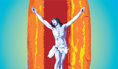
So, as you may have seen in the last Another Roadside Attraction post, I had a lot of elements I could have worked with for this cover. I eventually came to the conclusion that I needed to keep it very simple and create a design that would jump out at you from across the bookstore. So, the two elements I chose to focus on were... hot dogs and Jesus. Didn't expect that now did you?

A little back story: The book is about a hippy couple, John Paul and Amanda, who open up a hot dog stand along the highway in Washington State named "Captain Kendrick's Memorial Hot Dog Wildlife Preserve".  At the same time, through a series of misadventures, their friend Plucky Purcell gets wrapped up in a militant Catholic secret society and comes into possession of the corpse of Jesus Christ... which he steals and brings back to the roadside attraction. 

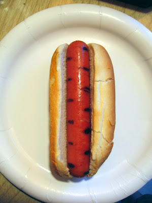
So, in honor of Captain Kendrick's, I started off with a basic picture of a hot dog which I myself took and then ate (the hot dog, not the picture).


Then I imported this picture with an older painting of Jesus on the cross into Adobe Illustrator. 


I traced both photos with VERY bright colors, cleaned them up a bit and removed elements. To top it all off and to make the site a little more sacrilegious, Jesus is now nailed to a giant hot dog.


Throw in a radial gradient background and some wispy, neon-like type and we have a very bright, very offensive cover:


Keep in mind, this is my very first cover exclusively using Adobe Illustrator (so be kind). The floor is now open for comments, questions, suggestions, and critiques.

Tuesday, July 15, 2008

CHECK IT OUT: Tales of Rocky Point Park


In the vein of classic comics like House of Mystery, Tales from the Crypt, and other early horror comics comes the newest (and, in my case, most local) offering: TALES OF ROCKY POINT PARKIf you're not from Rhode Island or have not seen the wonderful film You Must Be This Tall, let me let Wikipedia tell you about Rocky Point:


The Rocky Point Amusement Park was a highly popular landmark on the Narragansett Bay side of Warwick, Rhode Island. It operated from the late 1840s until its close in 1995. The park filed for bankruptcy a year later in 1996.

Brief enough for you?! Anywho, the short and skinny is that Rocky Point was an old amusement park that gave generations of Rhode Islanders years of enjoyment and fond memories.


Now, comic artist Jason Mayoh brings us the dark underbelly of this joyous place. Each issue starts with actual illustrated history of the park, particularly each individual ride or attraction.  After that,  things get creepy.


Mayoh takes the creepier elements of the actual histories and expounds on them with horrifying results. Issue #1 deals with the House of Horrors and it's awful life-like viking statue. Issue #2 talks about the Skyliner, a tram starting in the heart of the park and leading to a fairly creepy forest on top of a large hill. Oh, and did I mention UNDEAD MONKEYS!

The comic book nerd in me loves the whole  concept of the book but the graphic designer loves the supplementary material. At the end of each issue, Mayoh creates various pieces of "evidence" in the forms of letters and newspaper articles to back up his tales of terror. They're so well done, at first I thought they were real articles!

Anyway, whether your a fan of Rocky Point or love horror stories, PICK THESE COMICS UP! You will not be disappointed. Issues #1 and #2 are available for purchase at their website or local comic shops like The Time Capsule and Wildtime Comics.

Tuesday, June 24, 2008

Fun Design! Totally Offensive!

A little musical play and lyrics book brought to my attention by my good friend, Jason McGill:


Does the fun orange moon background and the beautiful illustration of the woman take a backseat to how offensive this seems? Can you even get into the military if you have a stutter?

Jason suggested that I redesign this. But I have a better idea. I'd like to see how YOU would redesign this. Create a design changing the cover of "K-K-K-Katy" and email it to prettydeadtrees@gmail.com. You won't win anything but you'll get your work posted on Pretty Dead Trees in the near future! 

I Look forward to seeing what you got!

Friday, June 20, 2008

Book 2, Update: Another Roadside Attraction by Tom Robbins

So you may have noticed that I've posted book 3 before the reimagining of book 2, Another Roadside Attraction. No, you didn't miss it. I just haven't done it yet!

In my defense, I've hit one of those good problems with this book: too many great ideas. I've been thinking about what I'd like to focus on but keeping it simple. Keep in mind that these were the things discussed in the novel (in no particular order):

- a roadside hot dog stand with 30' X 9' sign -
- a flea circus -
- Jesus -
- a white man who has taken on an African Tribal lifestyle (see animal skins, filed teeth, etc.) -
- a woman who goes into trances and has visions -
- an anthropomorphic baboon -
- mushrooms -
- a black-ops, militant section of the Vatican -
- butterflies -
- a rock n' roll circus -
- a child named Thor with electric blue eyes -
- endangered garter snakes -
- the 60's counter culture -
- etc. -

I think I've finally figured out what direction I'm going to go in and will be working on the cover this weekend. Be sure to check back next week for the update!

Tuesday, June 17, 2008

Book 3, Original Art: VOX by Nicholson Baker


Published by Vintage Contemporaries, Copyright 1993; Original Cover Design by Eric Leonard

"Jim and Abby meet over the phone when they both dial one of those 976 party lines that are advertised in adult magazines. After some exploratory small talk, they retire to the electronic "back room" for a more intimate chat. Baker has written a novel that remaps the territory of sex--solitary and telephonic, lyrical and profane, comfortable and dangerous. Written in the form of a phone conversation between two strangers, Vox is an erotic classic that places the author in the first rank of America's major writers."

Support an Independent Book Store! CLICK HERE to Purchase this Book!

Tuesday, June 3, 2008

The Nightingales of Troy: Great Book Cover

Being that I work for Books on the Square, a independent bookstore in Providence, RI, I get the opportunity to preview and review books before they come out. A current collection of stories I'm reading (that's being released in July 2008) is The Nightingales of Troy by Alice Fulton. While I'll be reviewing the book at a later time and place, I'd love to share the cover with you:


This beautiful cover was created by Kimberly Glyder, a designer out of Philadelphia.

This collection of short stories follows four generations of women (from great grandmother to great granddaughter) and the intriguing stories that connect them all. This cover perfectly reflects each story with the old clip art images on weathered pieces of paper each connected by a subtle dotted line. I also must commend Ms. Glyder on her use of fonts and decorative pieces (especially the adornment emanating from the bird).

I'm really enjoying this book so far. Be sure to check it out when it's released next month.


Support an Independent Book Store!
CLICK HERE to Purchase this Book!

Wednesday, May 28, 2008

My Winnipeg: Great Movie Poster

I absolutely loved Guy Maddin's film The Saddest Music in the World. Now he's coming out with a new movie called My Winnipeg which is described as "a hilariously wacky and profoundly touching goodbye letter to his childhood hometown. " 


I LOVE this poster! I find the muted colors, scratched film and worn corners very appealing. It's like the most screwed up photo in your family album. The unique elements jump out at you. I like the jumper's tropical looking shirt and the look of utter indifference on the older lady's face. I also find it hilarious that Winnipeg is being compared to suicide.

Check out the trailer:

Friday, May 23, 2008

Book 2, Background Info: Another Roadside Attraction by Tom Robbins

The reason I originally picked up Another Roadside Attraction was the fact that it had to do with… wait for it… roadside attractions! In the novel, a circus/naturalist/mystical/hippie couple open up a hotdog stand in Washington state called “Captain Kendrick's Memorial Hot Dog Wildlife Preserve”. The draw to this site is the 30-foot tall hot dog sign on the roof, an endangered garter snake habitat, flea circus, and a certain corpse of a Christian persuasion.

I think I’ve a certain affinity for these slowly disappearing roadside oddities. I could be due to the fact that I’ve grown up with one in my backyard ever since I was little.


The Big Blue Bug is Rhode Island’s strangest and most visible landmark. Directly looking out over I-95, its New England Pest Control’s highly inventive piece of advertising. I don’t think there’s a single person in Rhode Island who doesn’t know the name New England Pest Control because of that giant blue landmark. If you’re ever driving through Providence, RI you can’t miss it.

Some other sites you might also be interested in:

The Thing?, Dragoon Arizona
What is The Thing? Drive out to the middle of nowhere and find out!

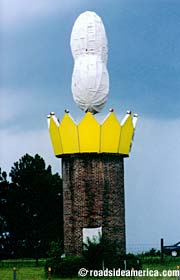
Along I-75, it’s the county’s tribute to the peanut.

Clark’s Trading Post, N. Woodstock, NH
My Favorite place in the entire world! Check out the performing bear shows and get chased by the crazed hillbilly “Wolfman” on a scenic train ride… I’m not making this up.

To learn more about roadside attractions near you, be sure to check out Roadside America, the definitive website for those weird little places around the country.

Monday, May 19, 2008

Book 1, Revamped Art: Pedro Páramo by Juan Rulfo

Thanks to the great comments from my friends in the last Pedro Paramo post, I am instituting a new element to PRETTY DEAD TREES: the Revamp! I'll take your suggestions and give it one last go.

It was suggested that the big black title block in the upper lefthand corner took away from the image. After studying it, I had to agree. So I ran with the old photo motif and decided to incorporate an old looking (possibly blood spattered ) label. And here's what came out of that:


I think it looks much better. But what do you think?